The Main Interface
Zenspire’s main window is designed for clarity and focus, divided into two primary areas:
- Sidebar (Navigation Panel): On the left, for navigating your library sources.
- Image Grid: On the right, for browsing images from the selected source.
Sidebar
Section titled “Sidebar”The sidebar provides access to all your image sources, organized into logical sections:
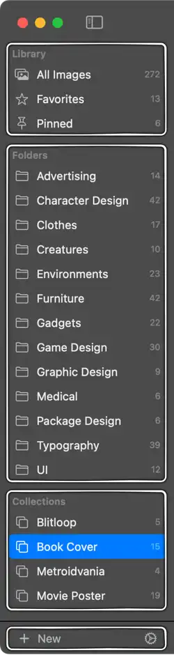
- Library: Smart sections for quick access. Details in the Library section.
- All Images
- Favorites
- Pinned
- Folders: Directly mirrors the folder structure within your Zenspire root folder on disk. Details in the Folders section.
- Collections: Your custom, virtual groups of images for projects, themes, or mood boards. Details in the Collections section.
You can also optionally display the number of images in each source. This is controlled in Settings.
Sidebar Toolbar
Section titled “Sidebar Toolbar”At the bottom of the sidebar:
- [+] New Button: Click the dropdown to create a new
Folder(on disk) orCollection(virtual). - ⚙️ Settings Button: Opens the application Settings window.
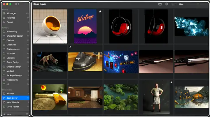
Image Grid
Section titled “Image Grid”This is where your images are displayed when you select a source from the sidebar. Details in the Image Grid section.
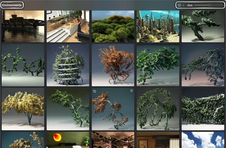
- Navigation Title: At the top of the window, shows the name of the currently selected Folder, Collection, or Library item.
- Grid Toolbar: Located in the main window’s toolbar area, providing controls for the grid:
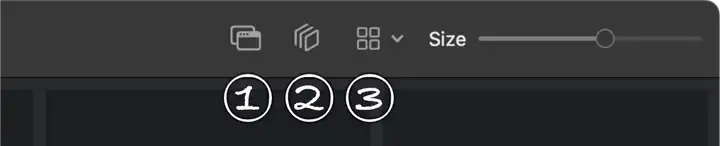
- Always on Top Button: Toggles whether the Zenspire window floats above all other application windows. The button is highlighted when active. Shortcut:
⇧⌘A. - Show Items in Subfolders Button: Toggles between showing images only from the current folder or from its subfolders as well. The button is highlighted when active. Shortcut:
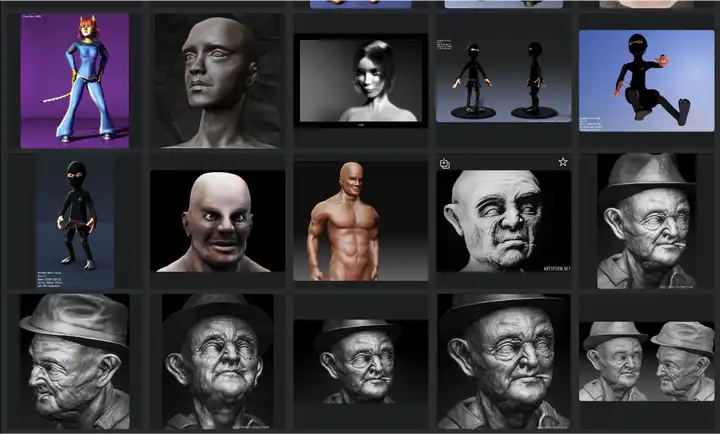
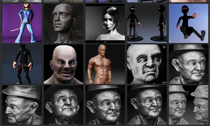
⇧⌘H. - Layout Menu: A dropdown menu to choose how thumbnails are displayed:
Preserves the image’s original aspect ratio within the thumbnail space. Good for seeing the full composition.
Creates a uniform grid using square thumbnails, cropping images if necessary. Provides a very neat, aligned look.
- Size Slider: Intuitively adjust the size of the thumbnails displayed in the grid.
- Always on Top Button: Toggles whether the Zenspire window floats above all other application windows. The button is highlighted when active. Shortcut:
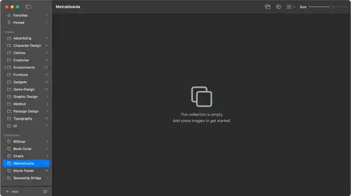
- Empty State: If a selected source contains no images, a helpful message and icon are shown in the grid area.